Skincare platform GetHarley has unveiled a new look and launched new consultation categories.
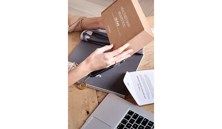
According to the company, changes in colour, fonts and language will be made. The new logo will have an emphasis on ‘Harley’ as well as mixed typefaces in the logo and treatments. The new globe symbolises the connections and service available around the world and the brand colours have some green and mustard to bring more gender neutrality, explains GetHarley.
In addition to the new look, customers will have a new choice of consultation, packaged to help communicate their needs. These include skin health and preventative ageing, pregnancy and nursing, medical dermatology and bridal.
Charmaine Chow, founder and CEO of GetHarley, said, “GetHarley 2.0 moves in a way that feels even more premium and elegant whilst keeping a lot of our existing brand essence, that is true to us, yet refined ever so slightly; think of it as a tweakment not a facelift. With a growing base of practitioners coming from all sorts of pedigree and specialism, we are proud to be launching more consultation ‘types’ on our platform, enabling us to take personalisation for consumers to the next level.”

